1.0 Critiques on the original design
This is the original design to illustrate Singapore’s Merchandise Trade Performance with Major Partners in 2020 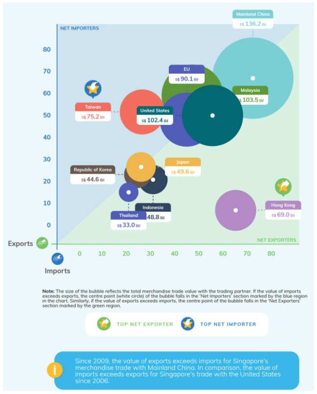
1.1 Clarity
(a) Incomplete axis labelling of both x-axis and y-axis: Although bubble chart label notation indicates ‘Bil’ (which means Billion), we are unclear if x-axis and y-axis are in ‘Bil’ units too as the units are missing from both x-axis and y-axis. Moreover, axis labelling (Import & Export) are placed at the bottom left corner of the chart which can cause confusion as to which axis is Import and Export. This can be improved by placing it at the end of the axis instead.
(b) Unclear label notation on bubble chart: Each countries are accompanied with a value label notation. However, we will not be able to differentiate whether this value is referring to total merchandise trade value or Net-Net value.
(c) Missing chart title: Title is missing from this chart and we are not able to determine what is this chart trying to tell us without looking at Department of Statistics website. We would not have known that this chart is a representation of Singapore Merchandise Trade Performance with majoring Partnering partners in which year or across which years.
1.2 Aesthetics
(a) Bubble overlapping: This is a interactive bubble chart as seen in Department of Statistics website. However, at first glance or without interacting with the chart, we are unable to view all the white circles (which indicating whether is it Net-Exporter or Net-Importers). It is hidden by overlapping solid colored bubble. This aesthetic leads to the clarity of the chart.
(b) No focus area is highlighted: The bubble chart aesthetics are colorful, However, the graph looks cluttered and no focus point. Instead of using solid colors for all partners and introducing additional symbols into the chart with side note, the bubble chart colors should be darker for Taiwan and Hong Kong to bring the focus on this 2 partners and a lighter color for the rest and a small text notation beside Taiwan and Hong Kong to indicate Top Net Importer/Exporter
(c) Interactive Design does not have much feature: This chart is an interactive chart, however, if we are looking at multiple years, there is no features to view other years.
2.0. Alternative Design
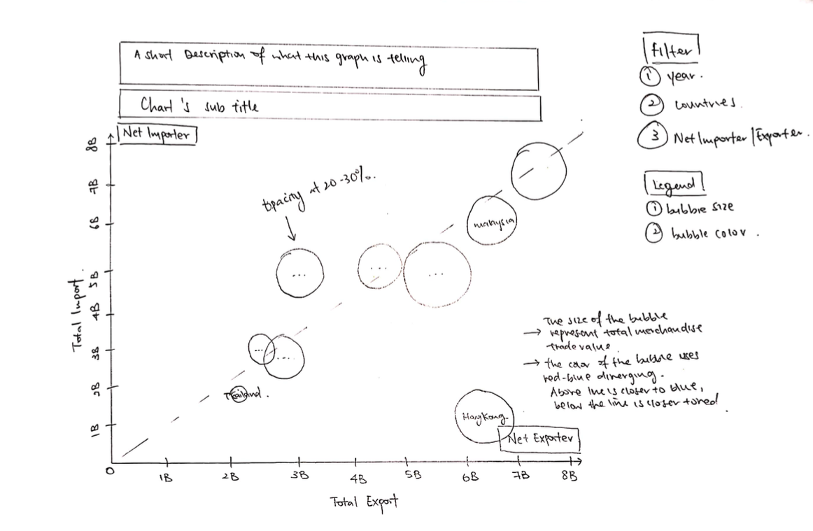
2.1 Clarity
(a) A Short Description in title section: Write a short description to describe what is kind of information is this chart protraying. For example, is it indicating Net Importer/Exporter or Total Merchandise Trade value.
(b) Proper Labelling on x and y-axis: Since the data are revolving around billions unit, it is best to add the unit (B) to x and y axis’s markers.
(c) Add filter for interactive design: We are looking at a range of 10 years data, therefore it is best to have a year filter to navigate and see the transition from year to year for a better user experience.
2.2 Aesthetics
(a) Introduce opacity to bubble chart: Add opacity level of 20-30% to introduce transparency to bubble chart in case of overlapping points.
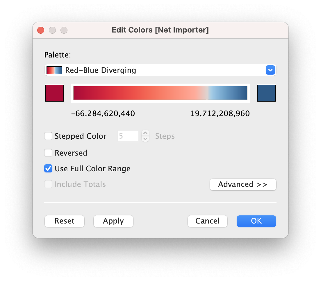
(b) Bubble chart color scheme: Intead of using different solid colors for different countries as per what DoSS has done, I introduce a red-blue diverging color scheme to different between Net Importer and Net Exporter. For points below the line will be colored closer o dark red and points above the line will be colored close to dark blue.
(c) Reduce the number of colors and symbols: As compared to the original graph from DoSS, it is flushed with numerous colors and there is no focus points. In my proposed visualisation, I opted for a simple and clean chart to protray the information. This way, it will not be too cluttered and would not confused the readers.
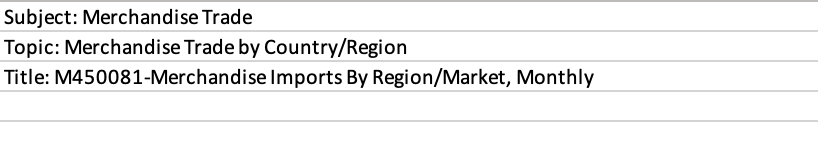
3.0. Proposed Data Visualization
Raw data are available at DoSS, under sub-section of Merchandise Trade by Region/Market.
Actual Data Visualization can be viewed at Tableau Public here
4.0. Data Visualisation Step-by-Step
4.1. Data Preparation with Excel and Tableau
Download and Open Excelsheet from DoSS
Remove Unnecessary rows
Rename worksheet T1 to ‘Import’ and T2 to ‘Export’

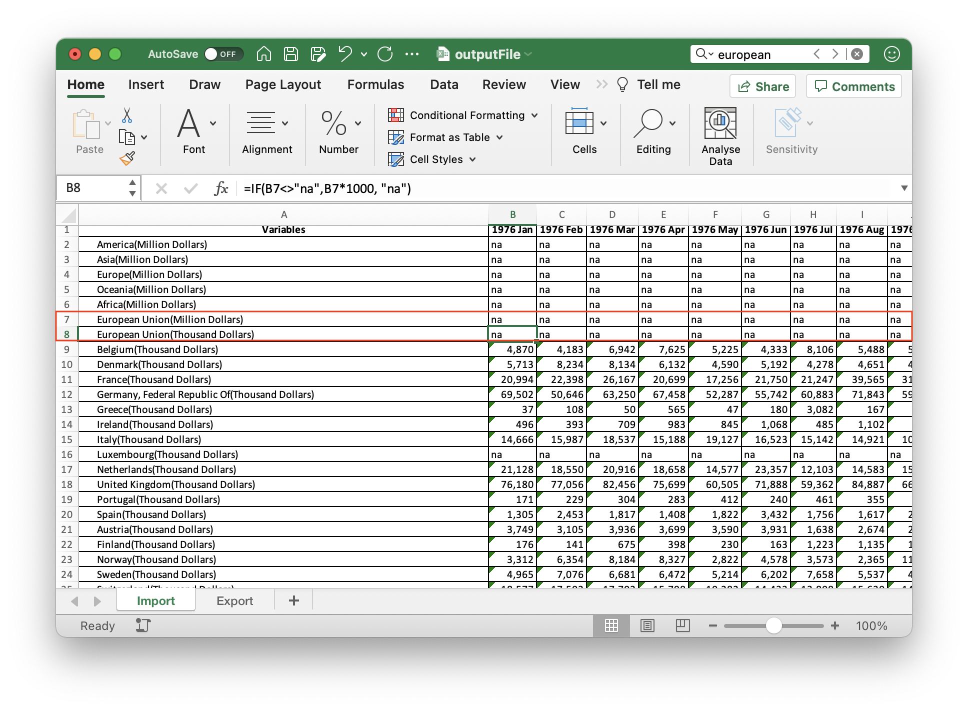
- One of the partners which we are interested on is European Union. However, the data is in Text format and Billion dollars.
- Change the change from ‘Text’ to ‘Number’
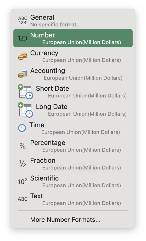
- Create a new row in excel to convert European Union to Thousand Dollars unit. Input the formula (=IF(B7<>“na”, B7 * 1000, “na”)) and apply it to the whole row
Import the excel data into Tableau
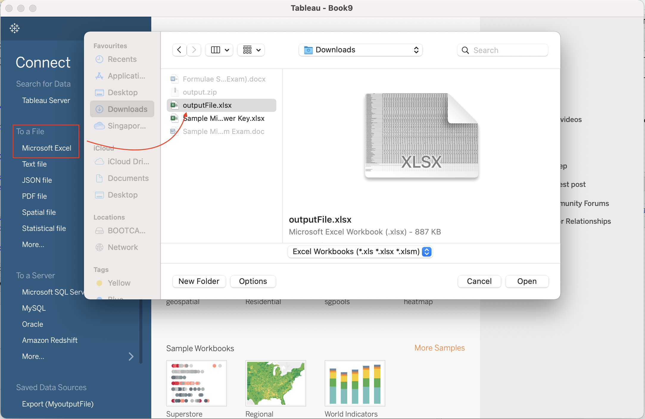
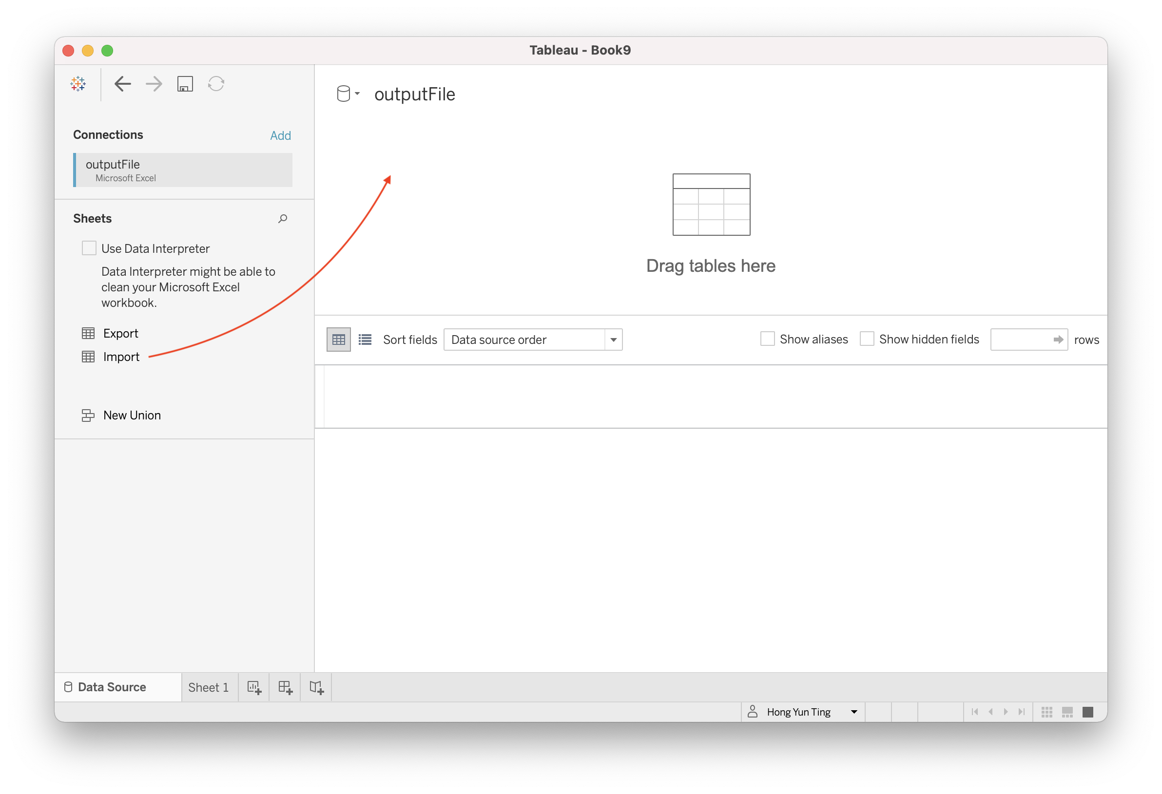
Drag & Drop “Import” Data Source into the blank space
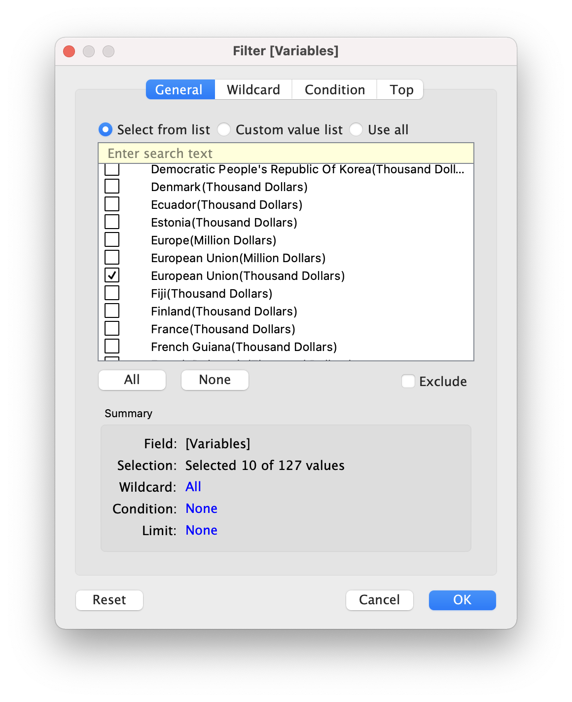
Proceed to Filter out the 10 Trading Partners (European Union, Hong Kong, Indonesia, Japan, Malaysia, Mainland China, Republic of Korea, Taiwan, Thailand, United States)
- Click on Filter at the top right hand corner
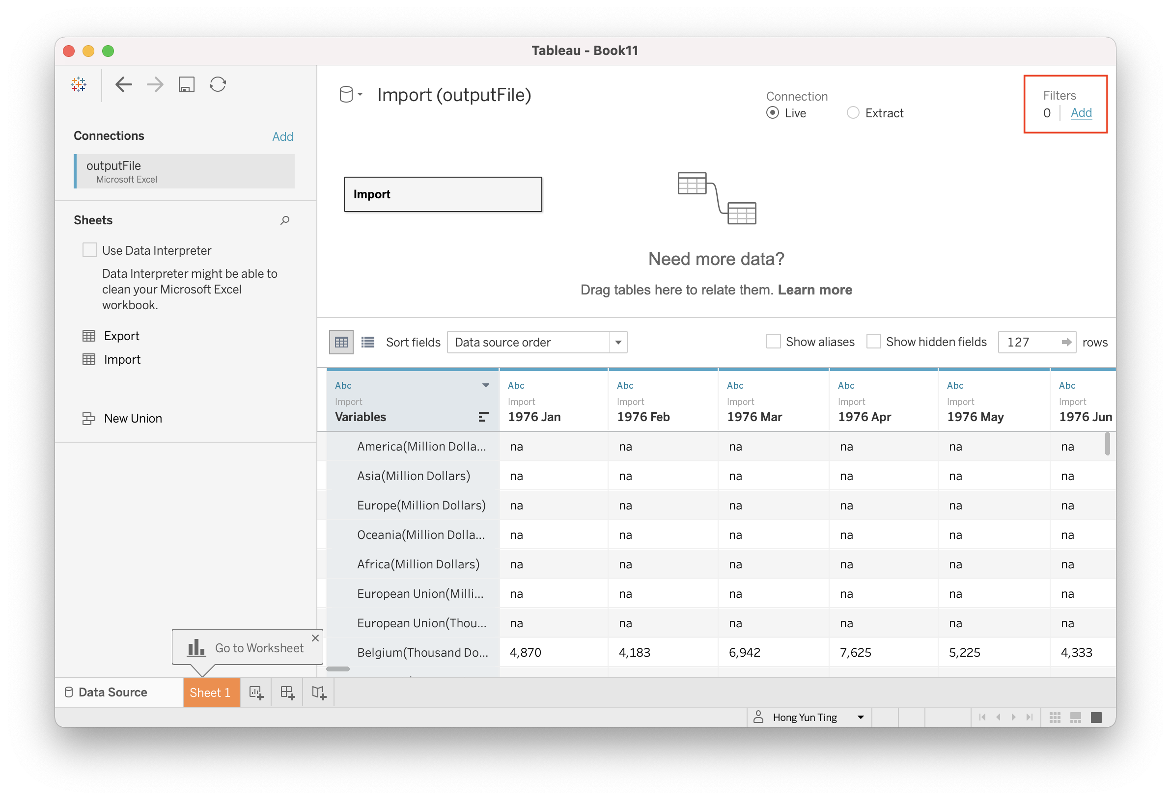
- Click on “Add” to select the variables of which we want to filter the data from
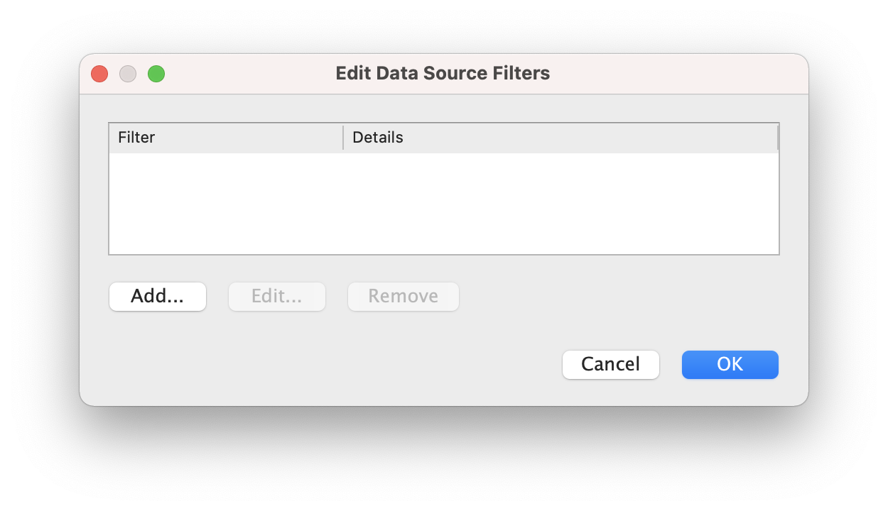
- Select Variables (Which is essentially our trading partners) and Click OK
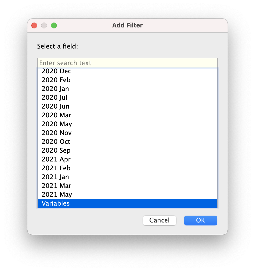
- Select the 10 trading partners (Be mindful to choose “European Union (Thousand Dollars)” instead of “European Union (Million Dollar)”)
- Separate out trading partner with dollar units
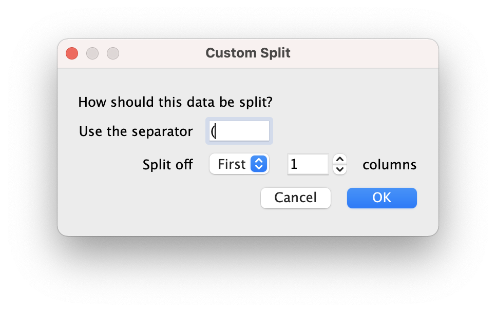
- Click on the little triangle and choose “Custom Split”
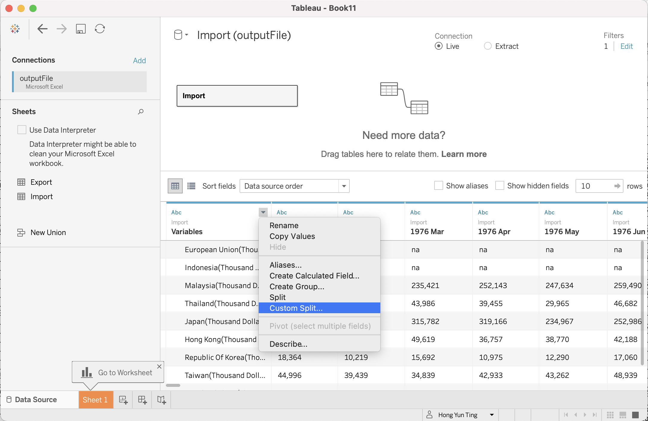
- Input “(” in ‘Use the Separator’
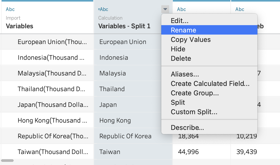
- Rename the newly created split column to your intended name by click on the little triangle > Rename
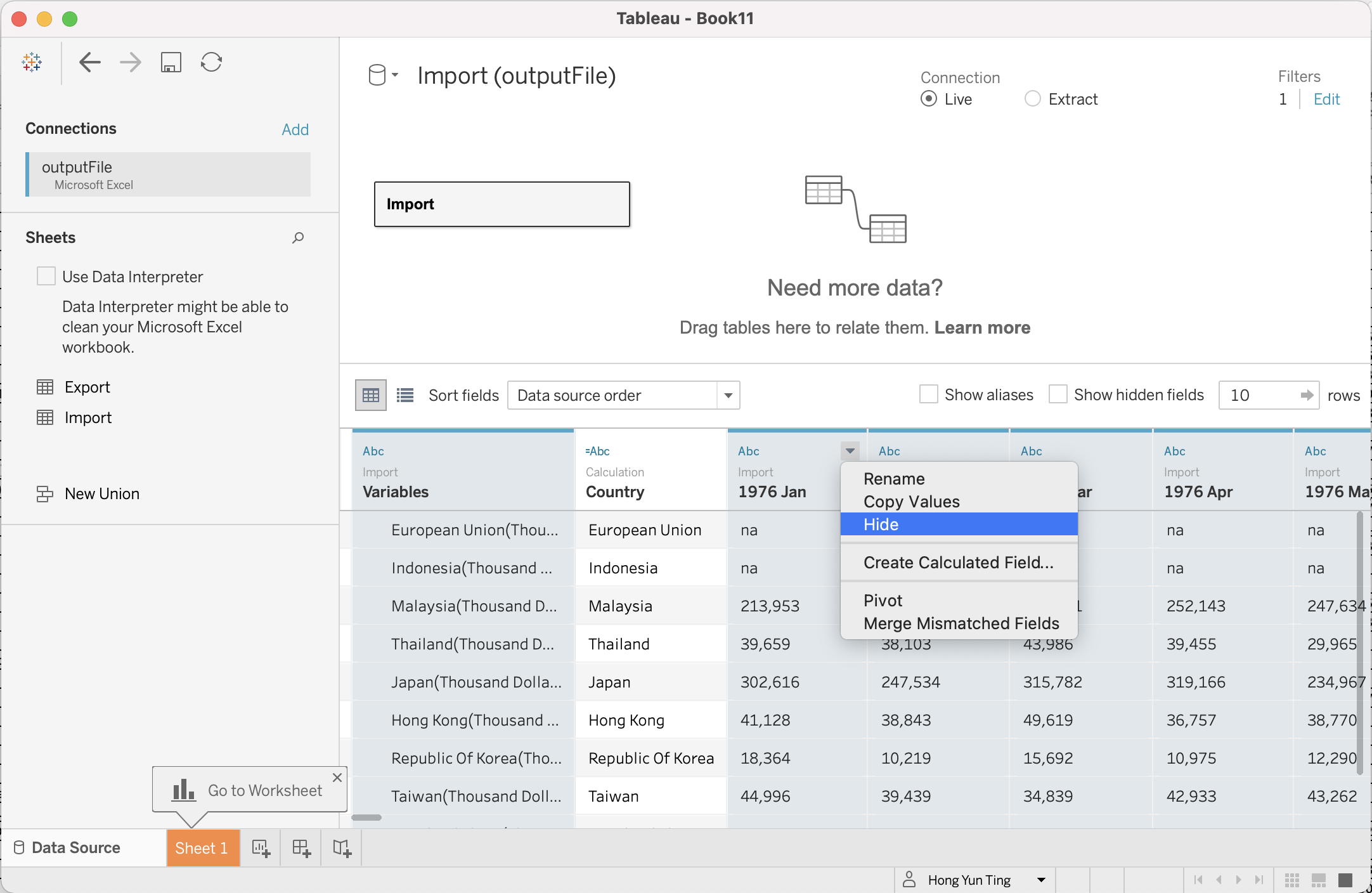
- Hide all unused columns
- Hold onto “Cntrl” key on the keyboard (“Command” for Mac) and select the year from 1976 Jan to 2010 Dec, 2021 Jan to 2021 May > Click on the little triangle > Hide
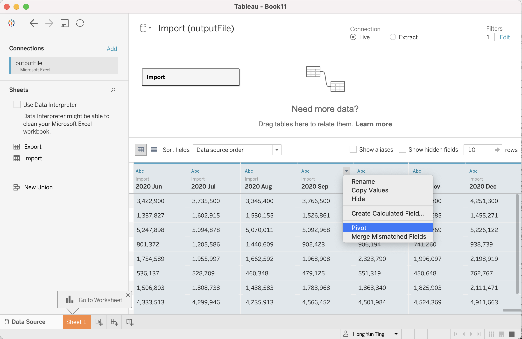
- Re-arrange data such that Period are gathered in 1 single column, per country
- Hold down on Cntrl key and Select 2011 Jan to 2020 Dec > Click on little triangle > Pivot
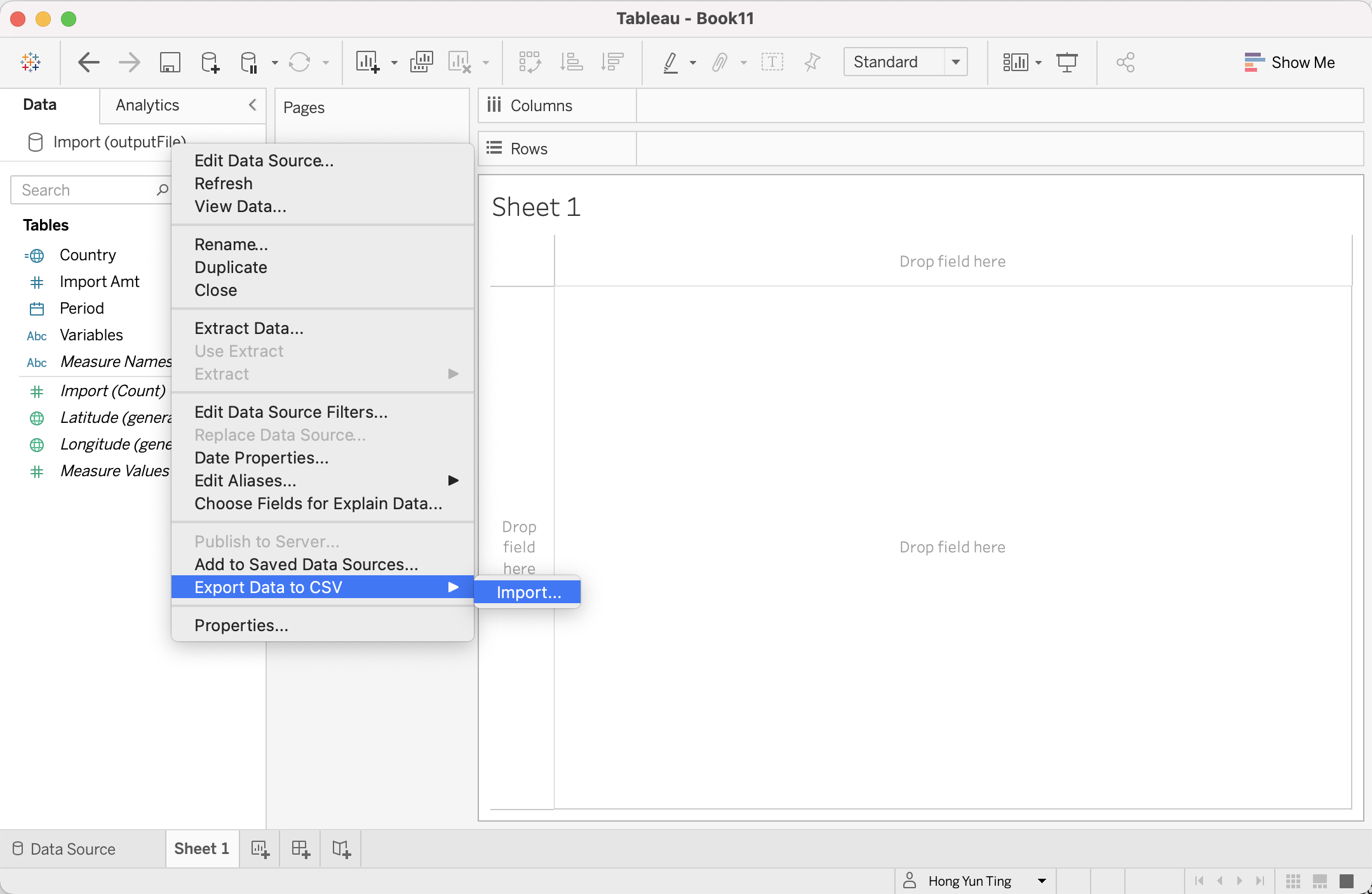
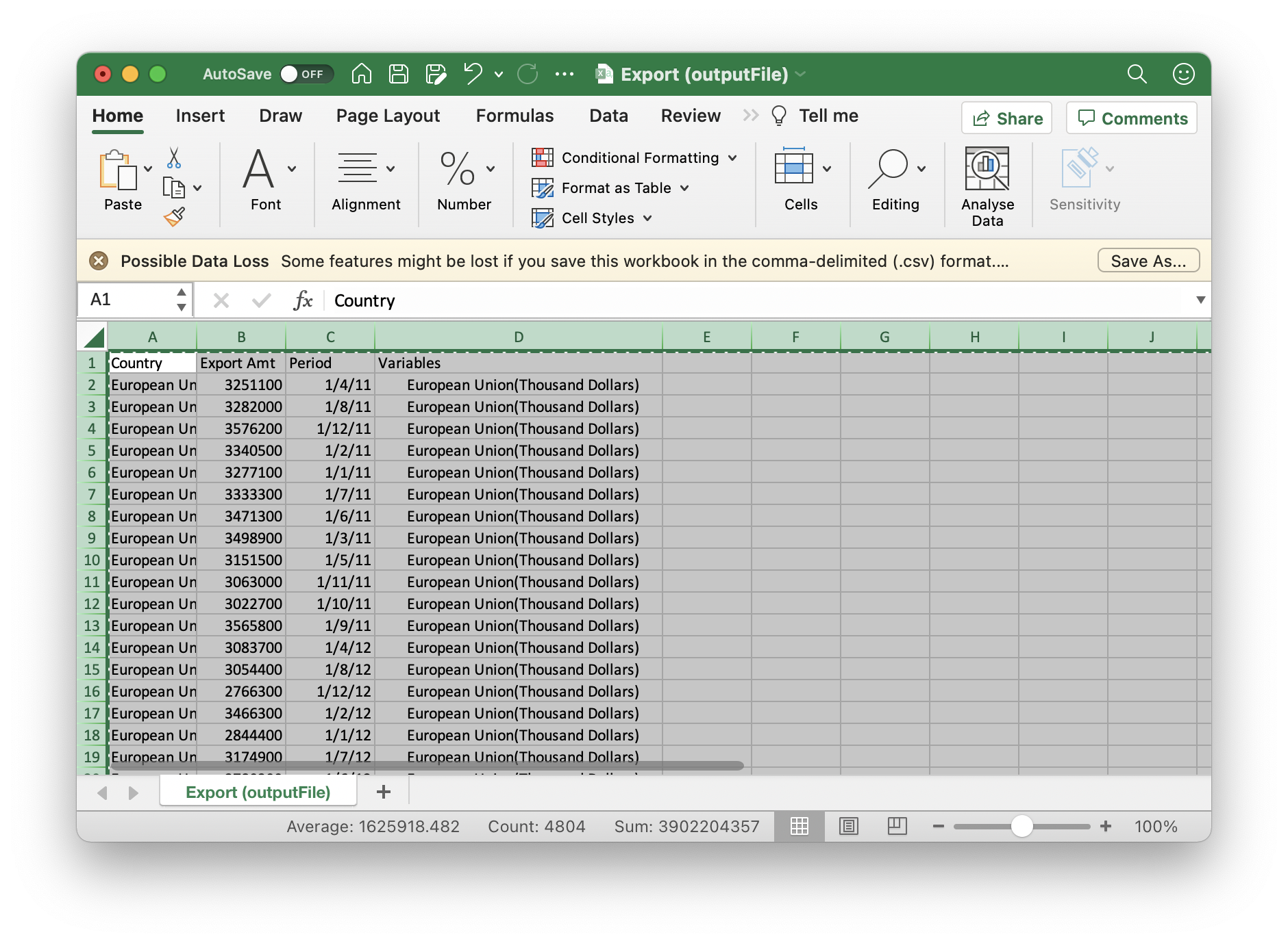
Save the edited data into a CSV file. Click on Sheet 1 at the bottom tab > Right Click on the Data “Import(outputFile)” > Export Data to CSV > Export
Repeat Step 6 to 11 for “Export” trade Data
The next step is to merge both “Import” and “Export” CSV trade data together
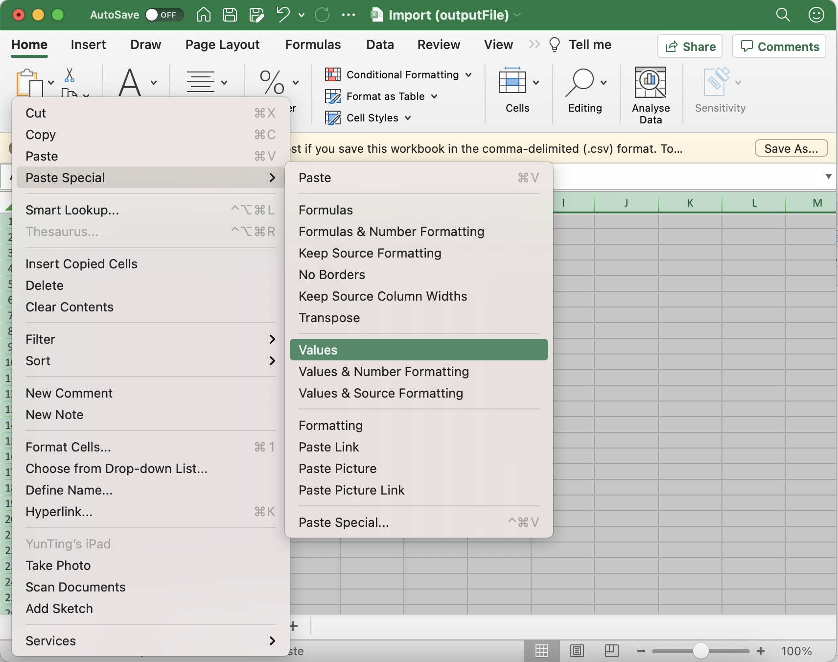
- Open “Export” CSV file, Copy and Paste it to a new worksheet in “Import” CSV file
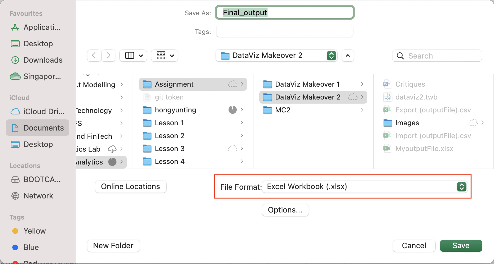
- Save the CSV file (Final_output.xlsx) as XLSX to save both worksheet into 1 excel file
- Import (Final_output.xlsx) into Tableau
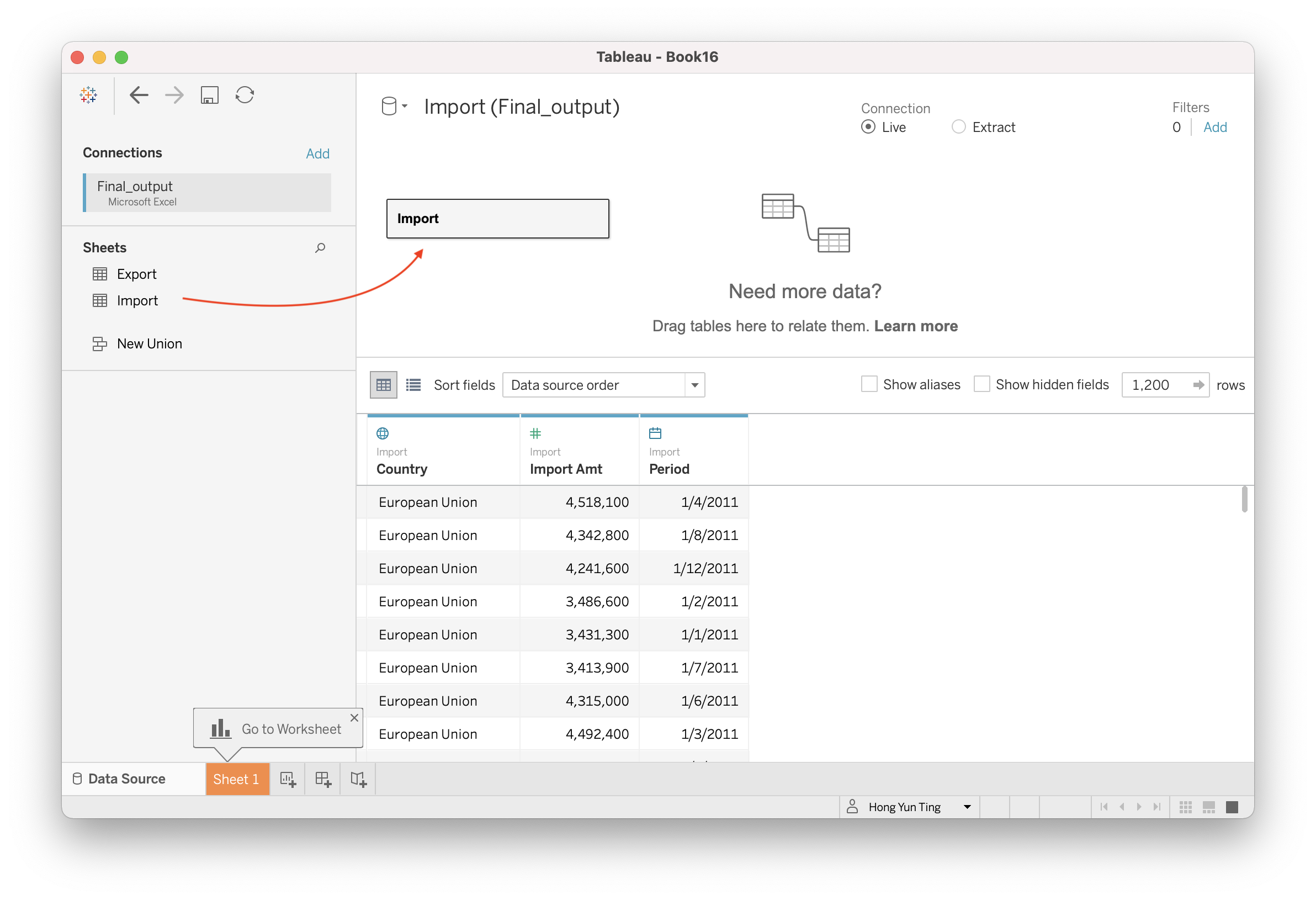
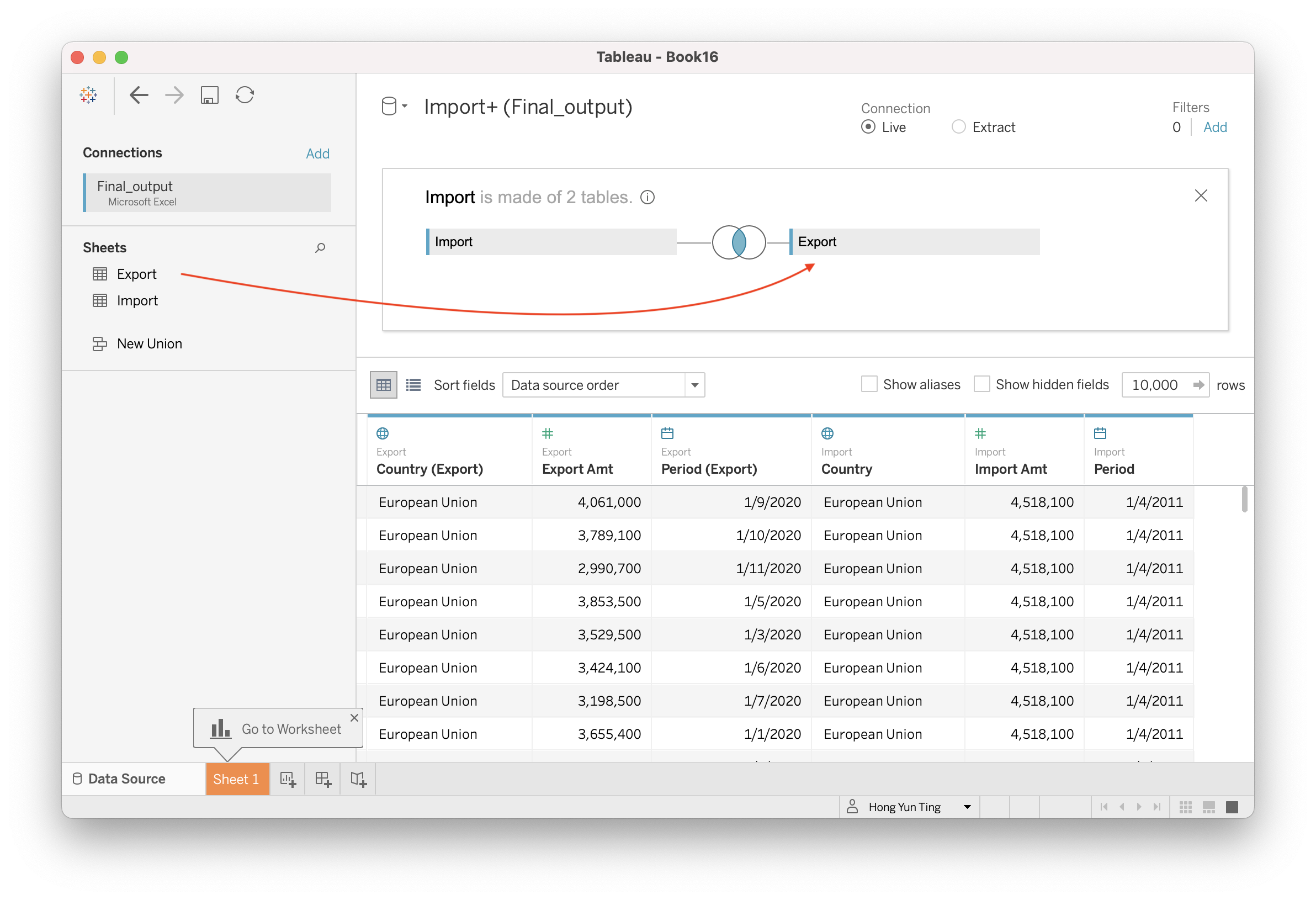
- Combine “Import” and “Export” worksheet into 1 datasource
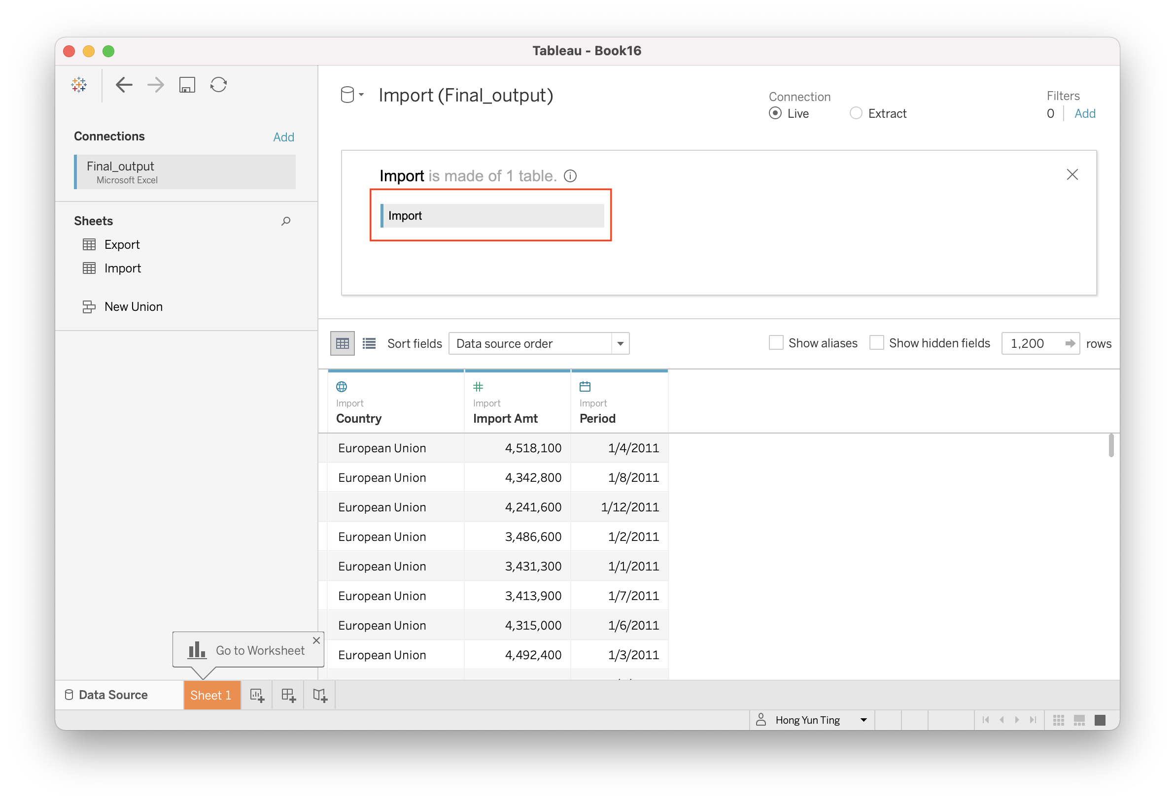
Double click on “Import” and the screen will display “Import is made of 1 table”
Drag & Drop “Export” next to Import. A venn diagram symbol is created between “Import” and Export"
4.2 Creating Chart
Navigate to a new sheet in Tableau.
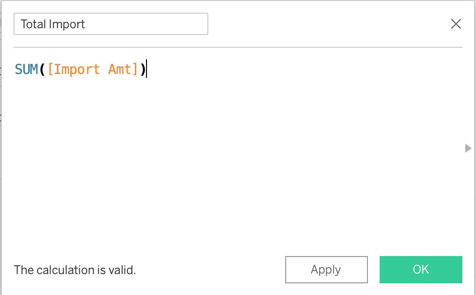
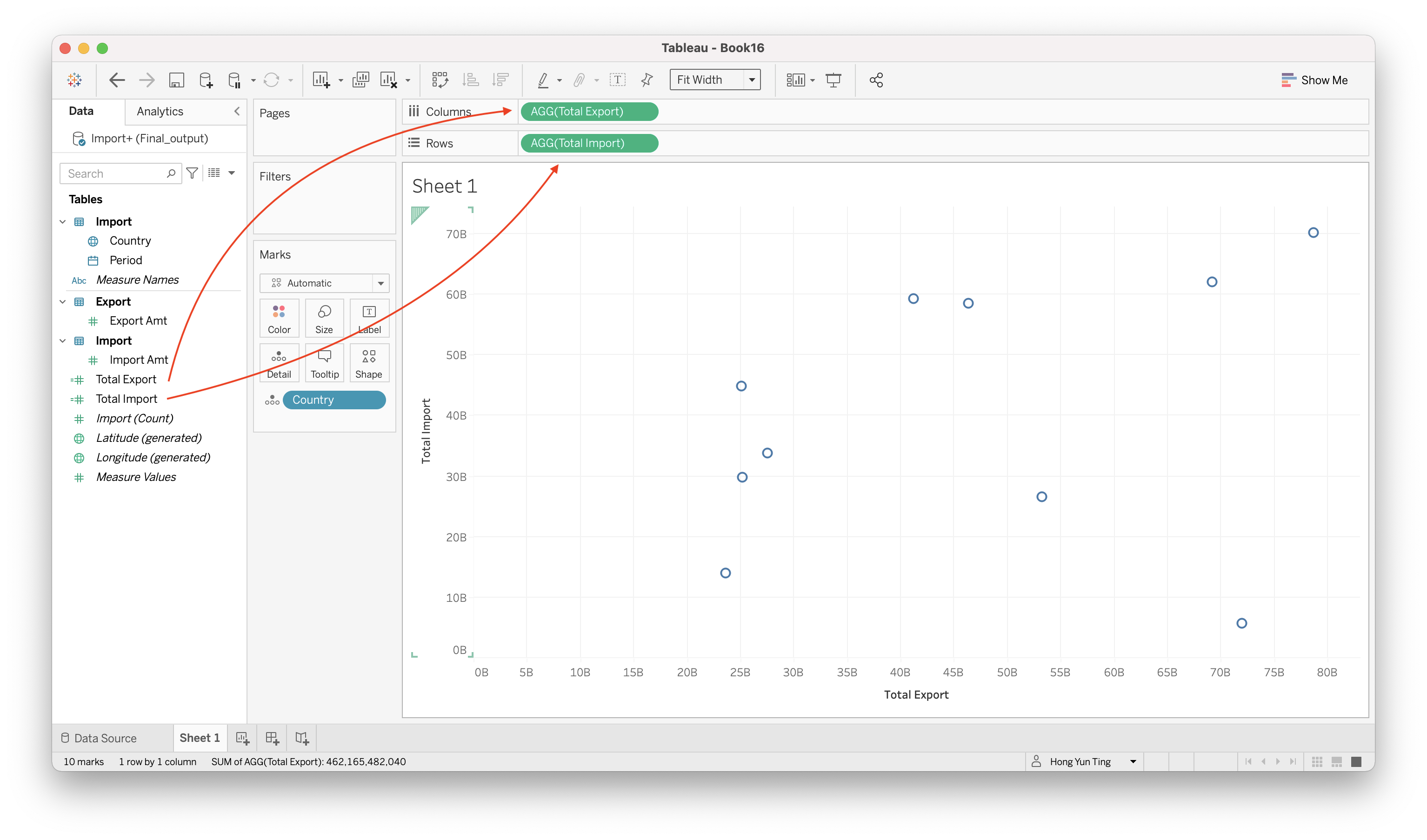
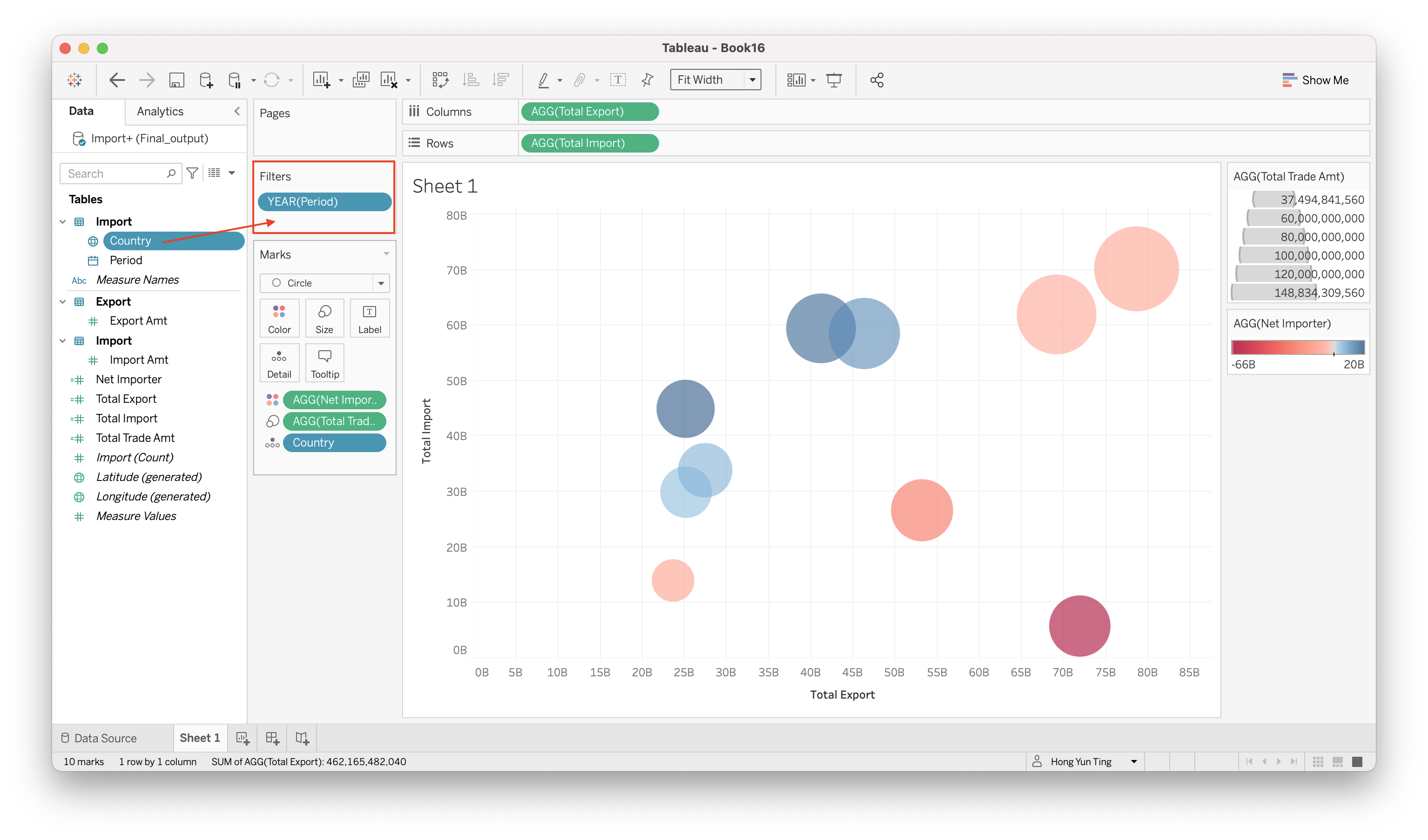
Create new parameters (Total Import and Total Export) Analysis > Create Calculated Field For “Total Import”: SUM([Import Amt]) For “Total Export”: SUM([Export Amt])
Drag & Drop “Total Import” to Rows and “Total Export” to Columns
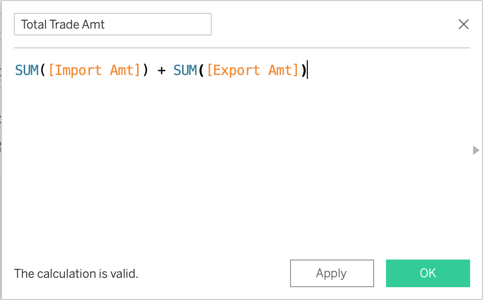
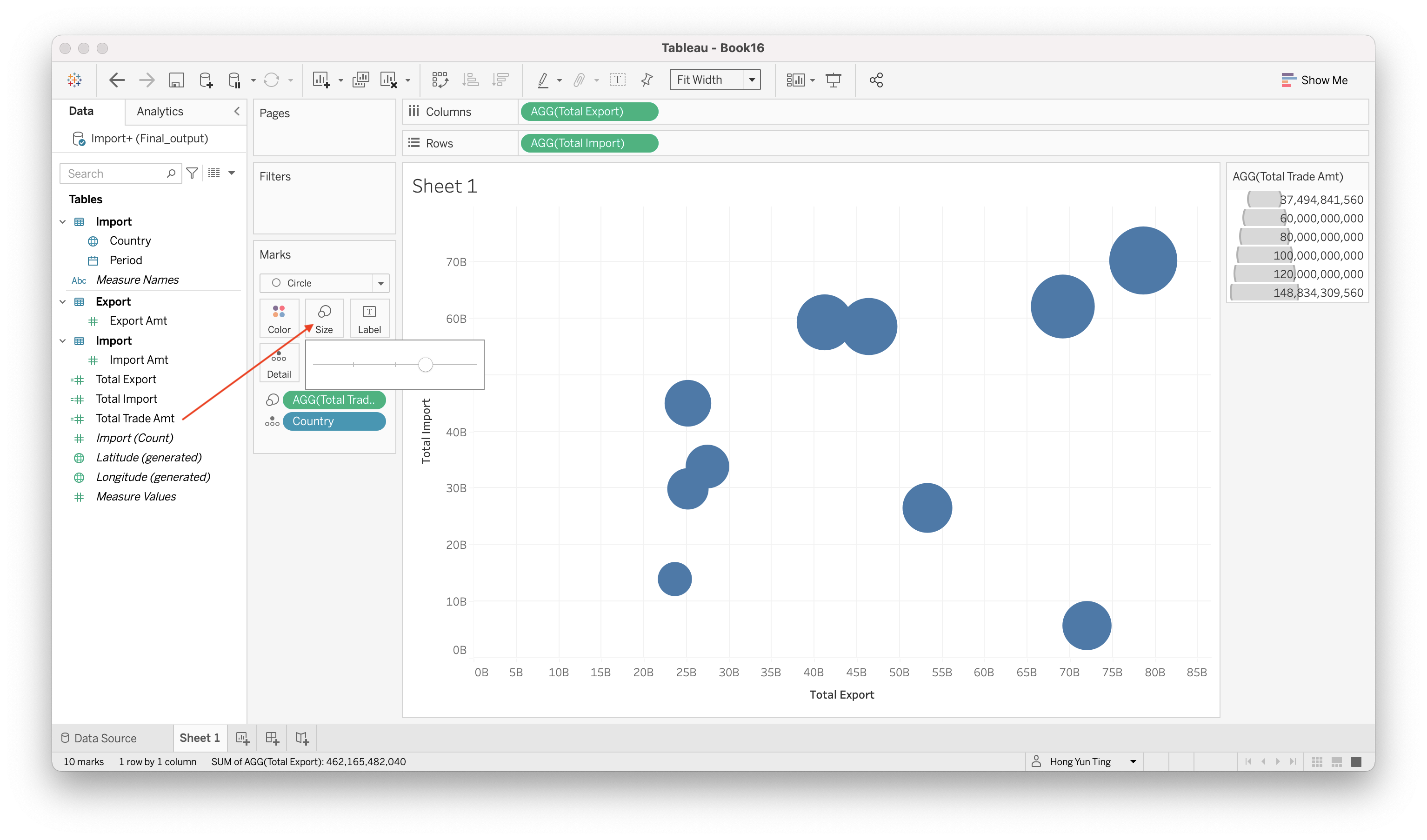
Create another Calculated field for Total Merchandise Trade Amount Analysis > Create Calculated Field “Total Trade Amt”: SUM([Import Amt]) + SUM([Export Amt])
Drag & Drop “Total Trade Amt” to Size, and click on “Size” and adjust the slider
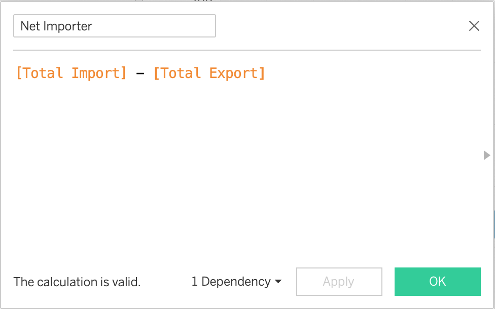
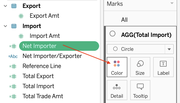
Create another calculated field Analysis > Create Calculated Field “Net Importer”: [Total Import] - Total Export
Drag & Drop “Net Importer” to Color
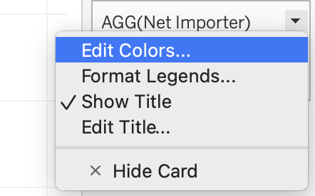
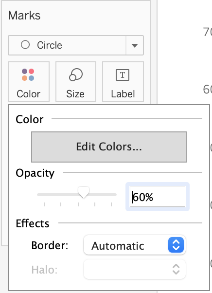
Edit the colors of the bubble plot
At the right panel, find “AGG(Net Importer)” and click on the little triangle > Edit Colors
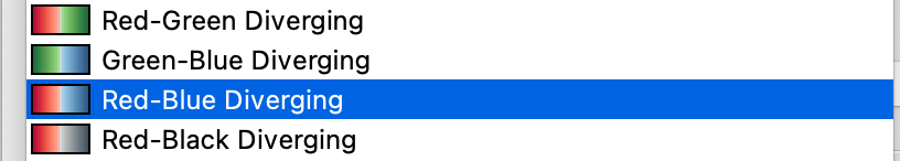
Choose Red-Blue Diverging
Check “Use Full Color Range” and Click OK
Click on Colors and change teh opacity of the bubble color
- Build Filters for Period
Drag & Drop Period into Filters
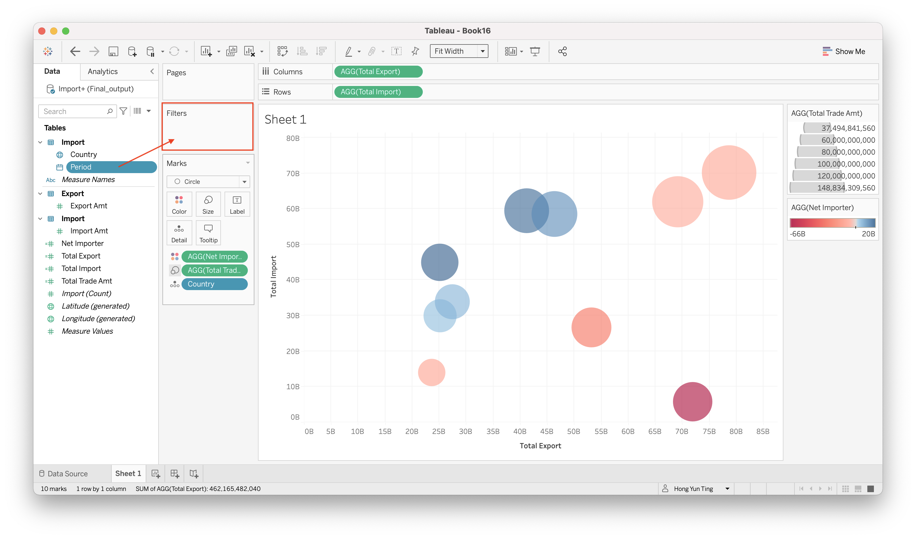
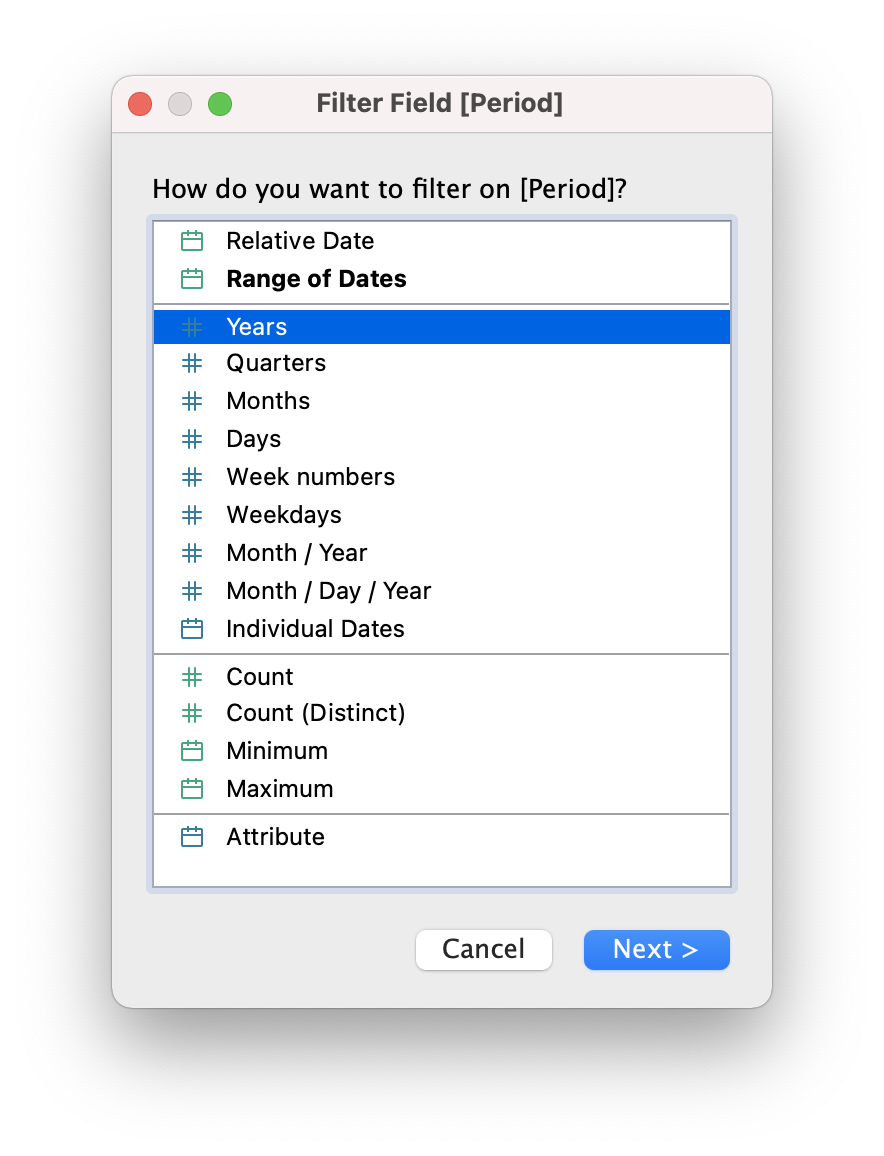
Select “Years” and click Next >
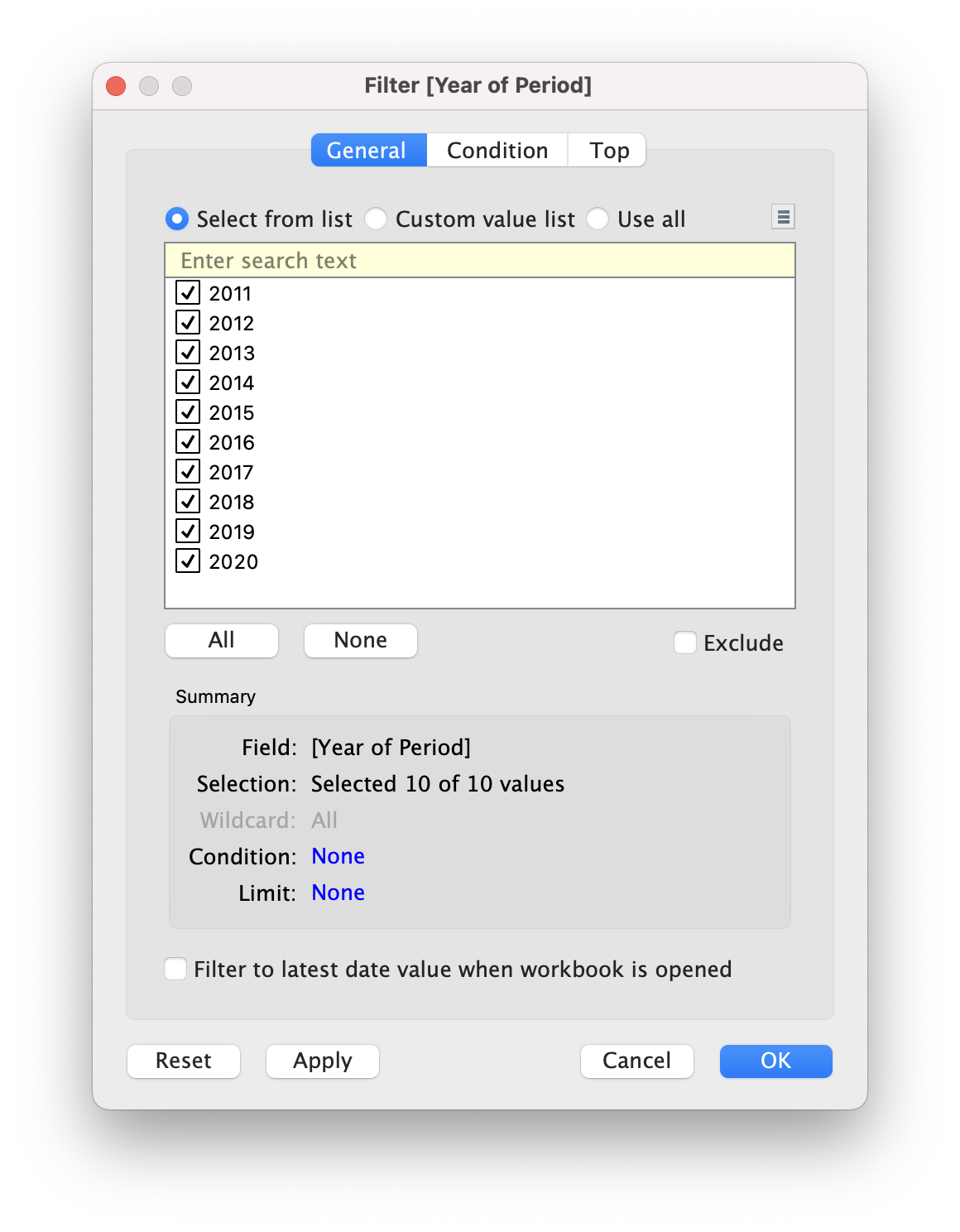
- Select all 10 of 10 values and click OK
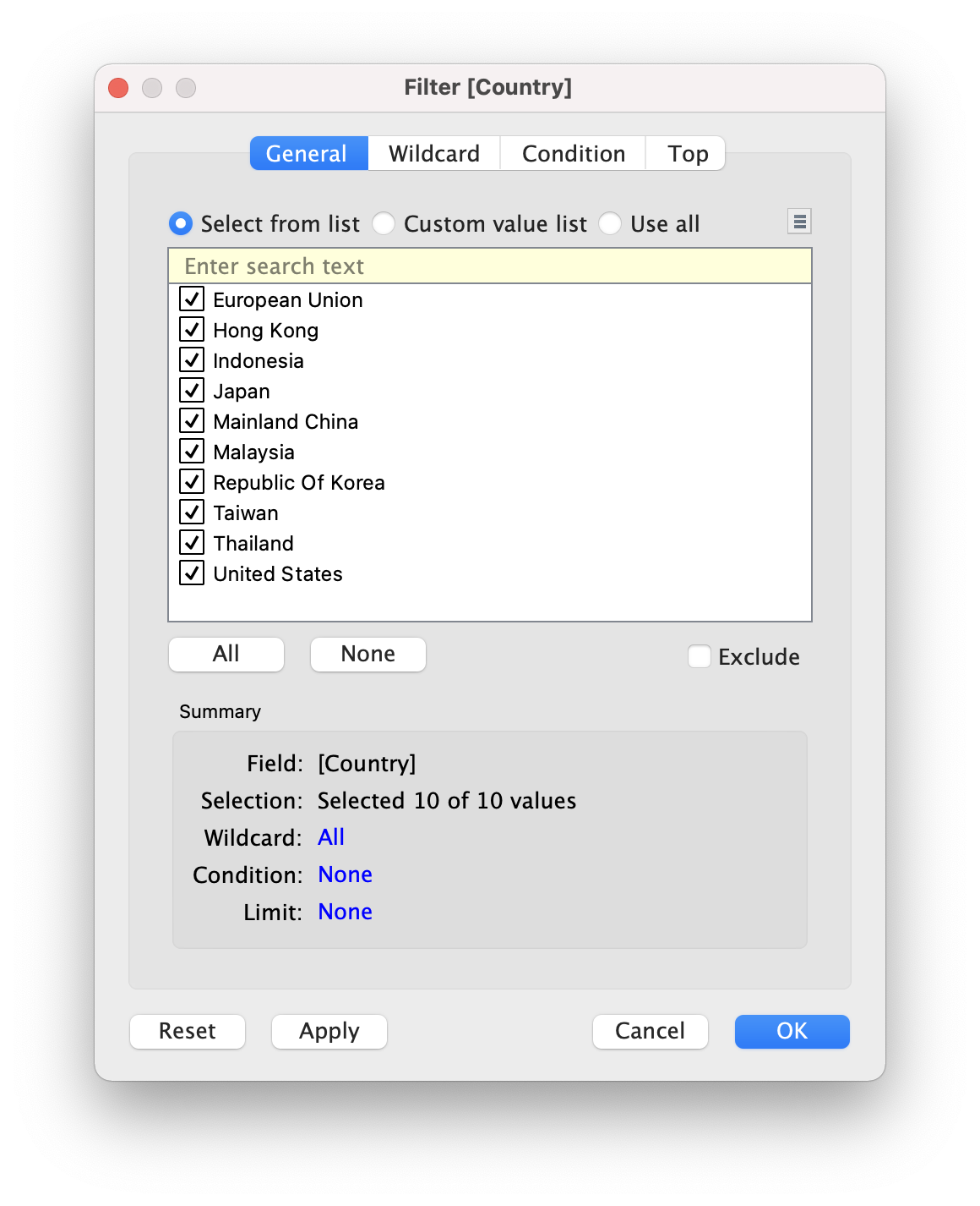
- Build filter for Country
Drag & Drop Country into Filter
Select all 10 countries and click OK
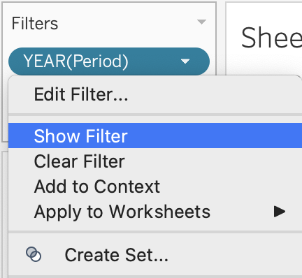
- Display the filter Under Filter > Click on little triangle > Show Filter (Do it for YEAR(Period) and Country)
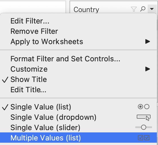
- Edit the filter display type
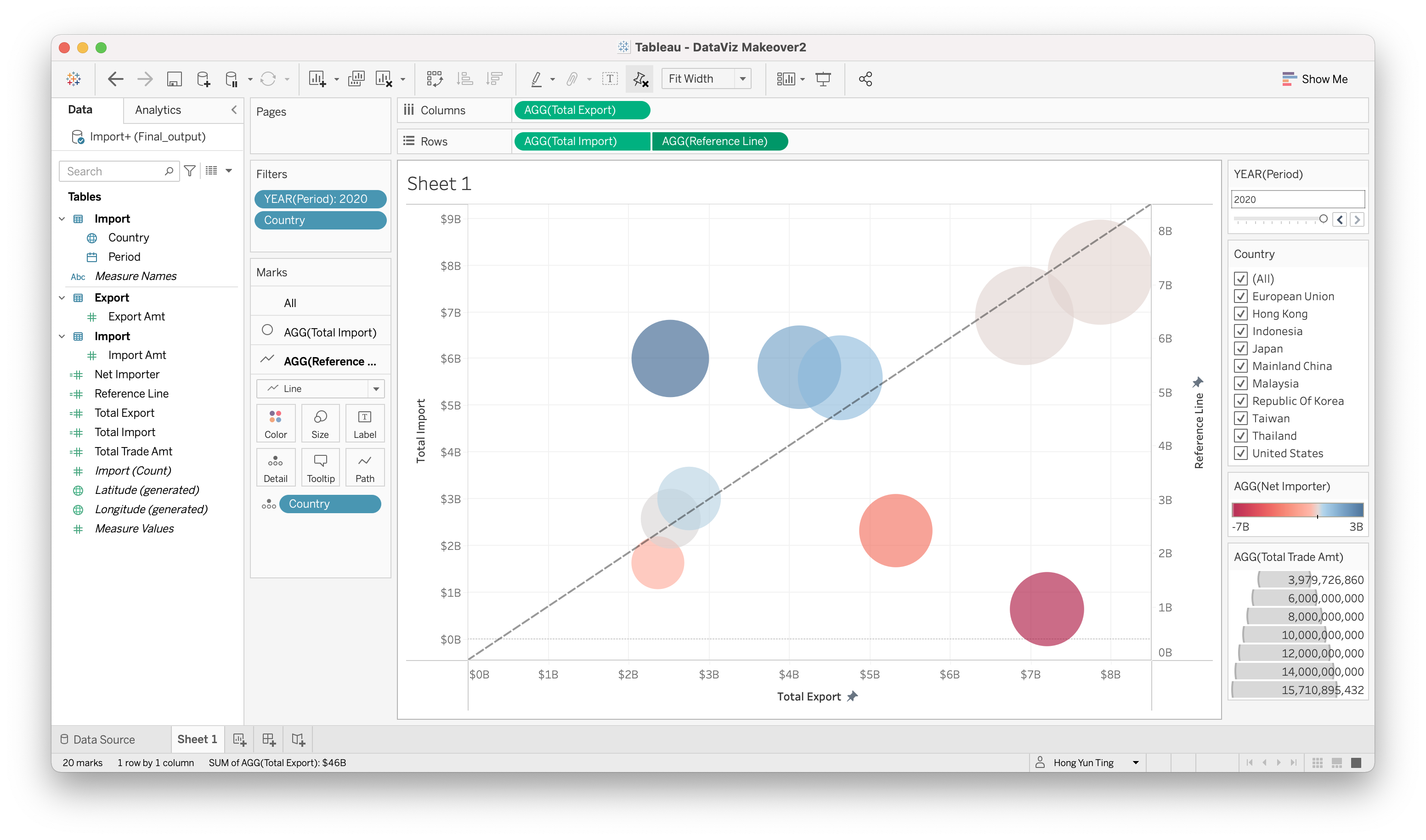
- On the right panel:
- “Year” - click on little triangle > Single Value (Slider)
- “Country” - Click on little triangle > Multiple Values (List)
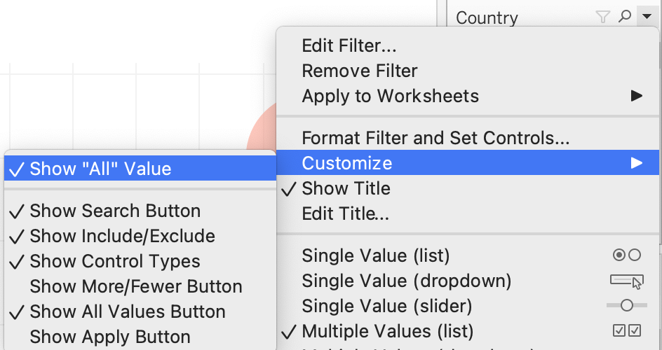
Remove “All” from Year Filter.
Click on little triangle > Customize > Uncheck “Show”All" Value"
- Adding Reference Line to differentiate Net Importer and Net Exporter
Analysis > Create Calculated Field
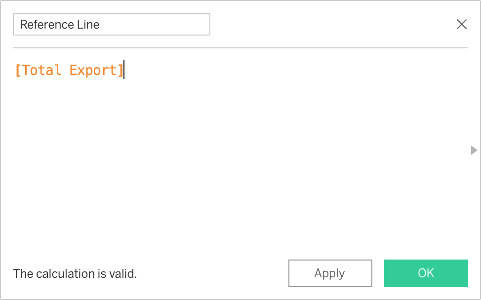
Drag & Drop “Reference Line” on Rows
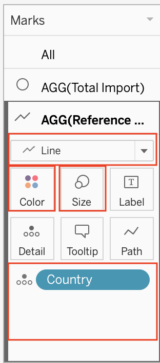
Adjusted the Properties for Reference Line
- Drag & Remove all properties except “Country” in details
- Change from Circle to Line Chart
- Change the Size to the smallest
- Change the color to black
Right click on the line chart > Trend Lines > Show Trend Lines
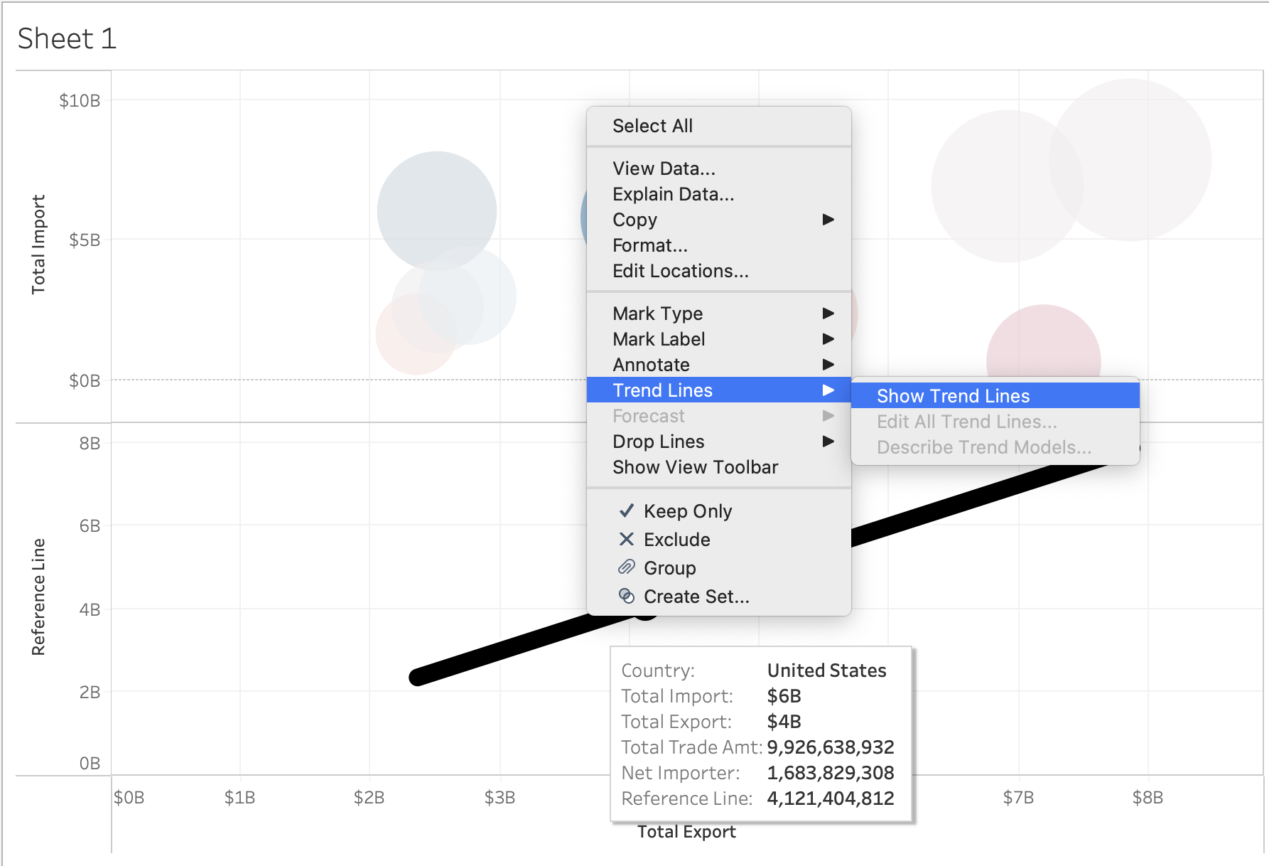
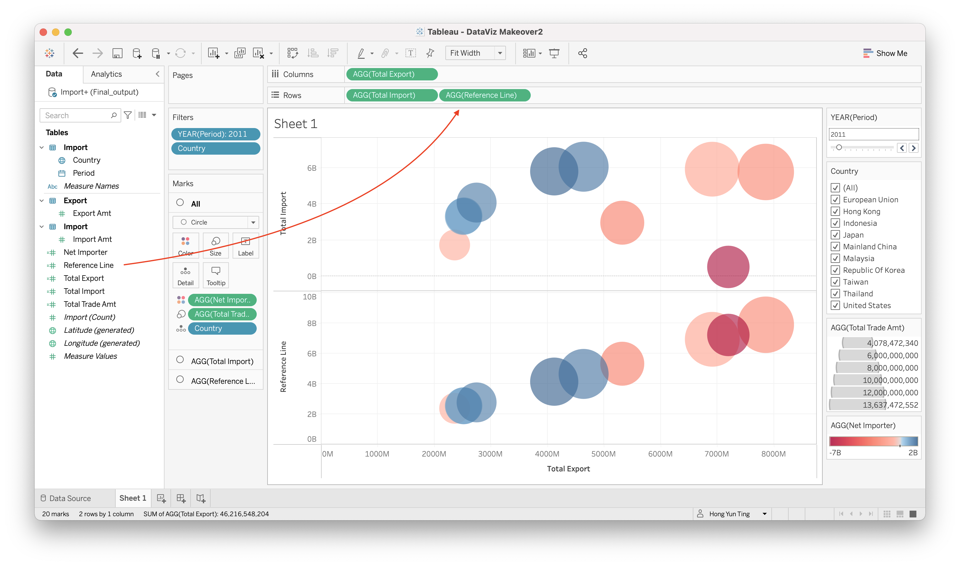
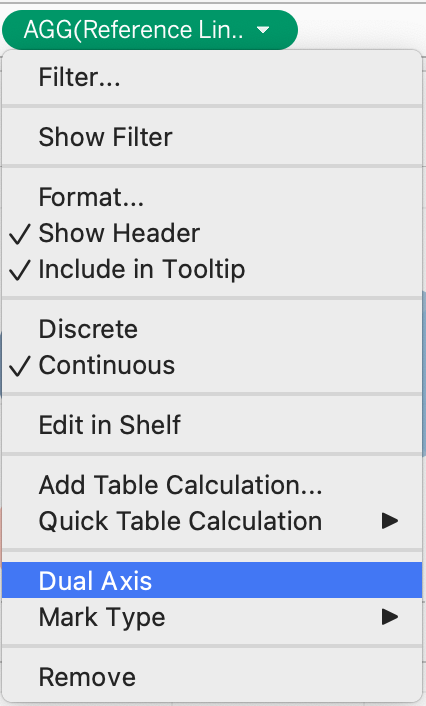
Once you have done the above step correctly, it will look like this
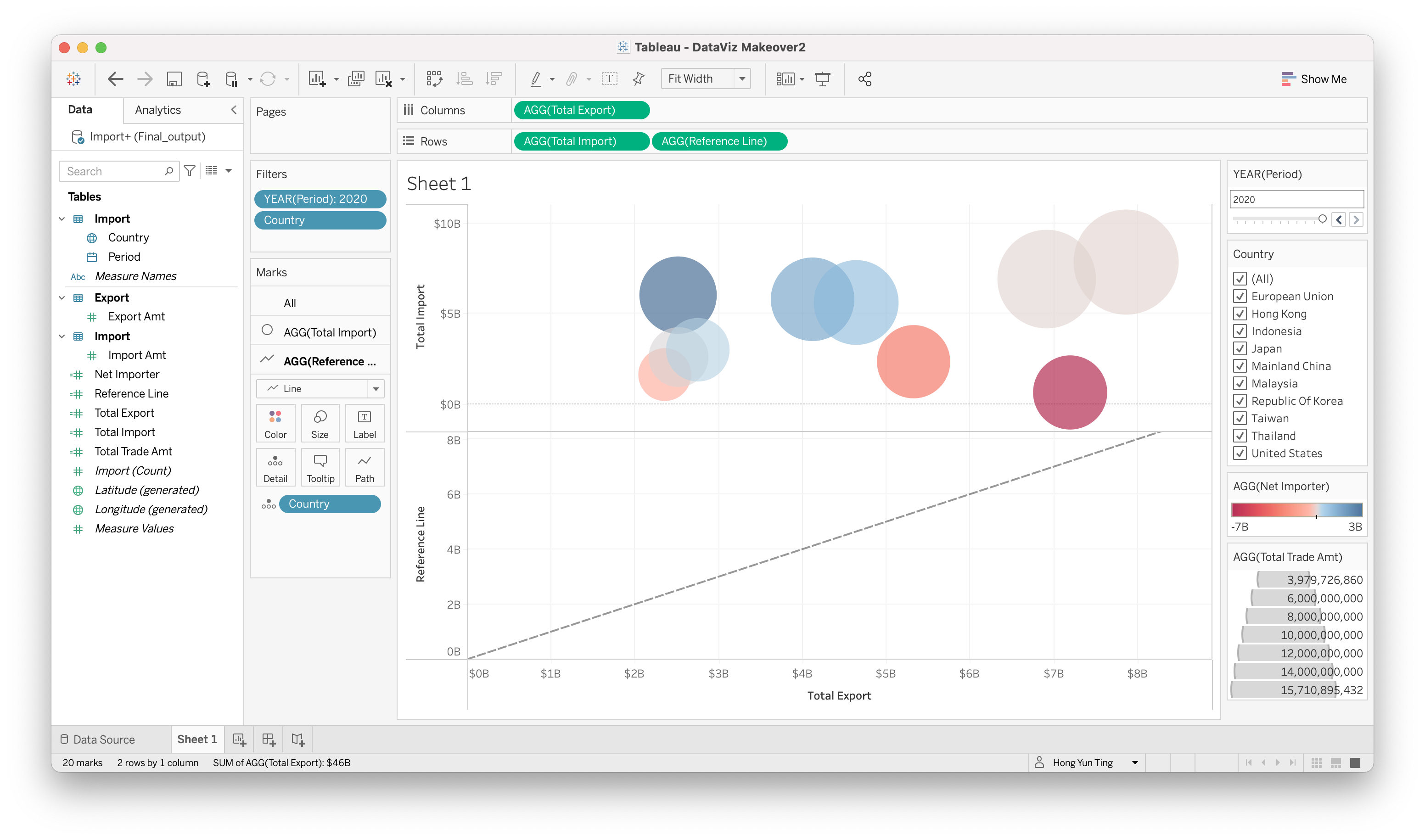
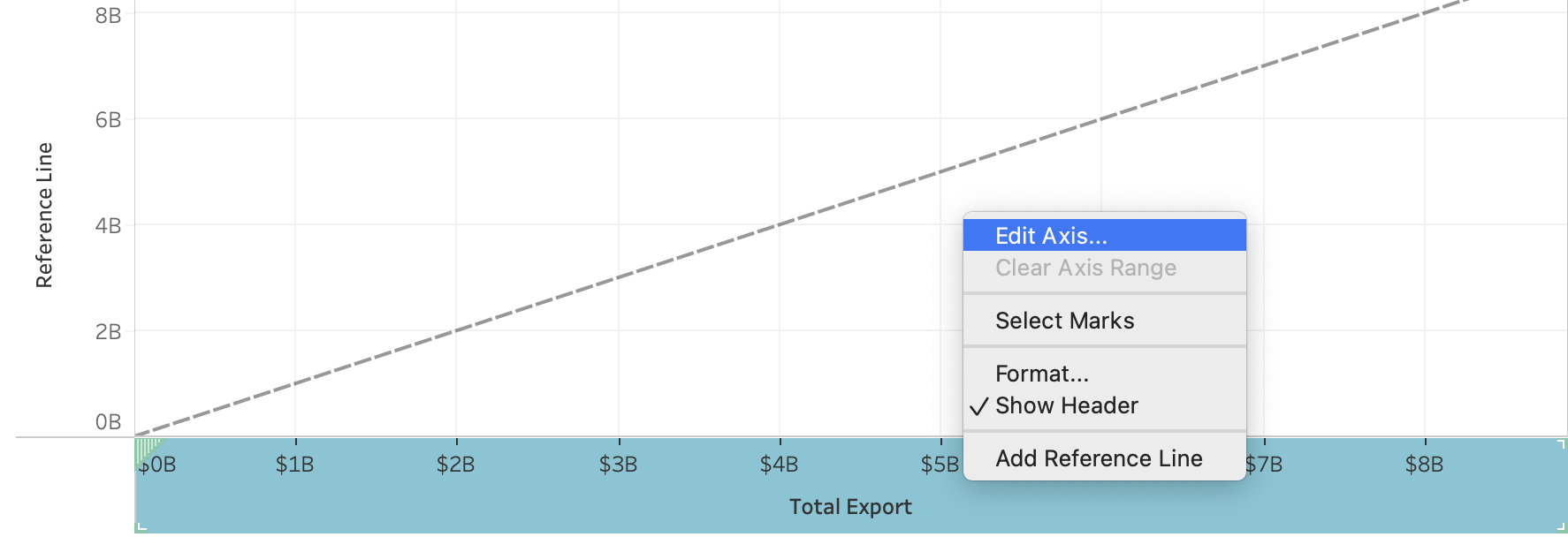
However, if you notice, the diagonal line is not drawing end to end.
- Right click on the axis > Edit Axis
- Select “Fixed” and change the Fixed end to 8.5B
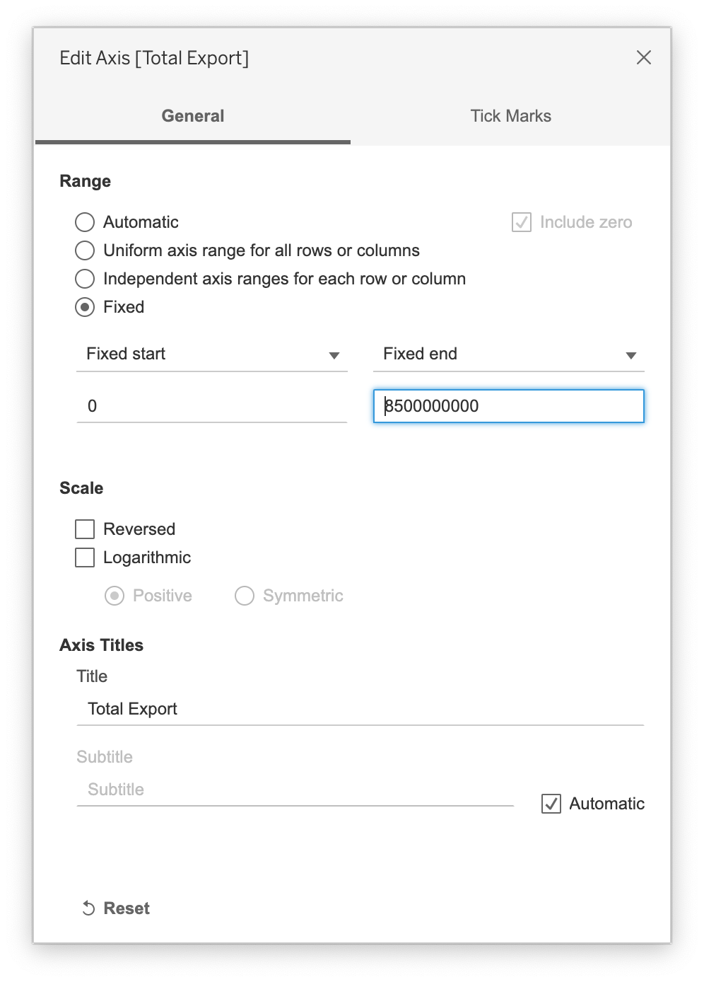
- A perfect diagonal line is drawn
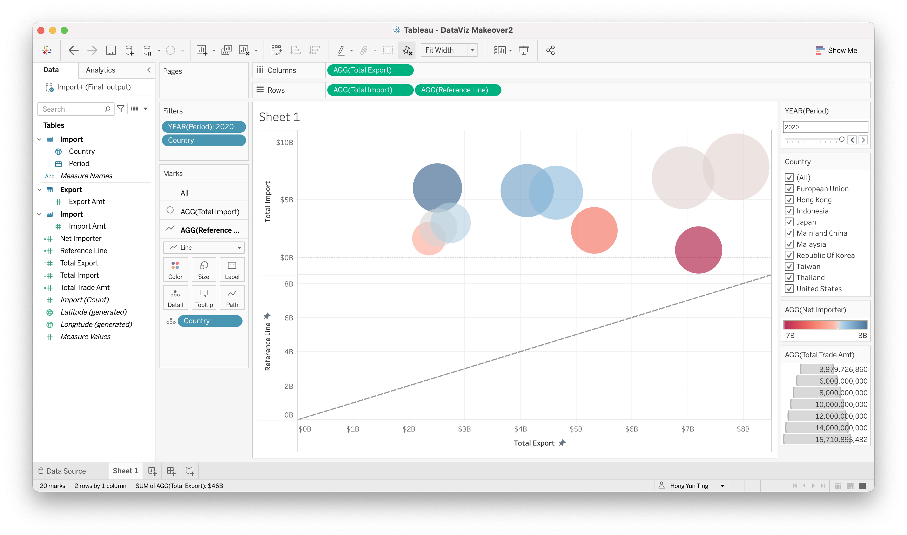
- Go to the Row sections > Click on the little triangle > Dual Axis
- Adjust the trend line properties
- Right Click on the trend line > Format
- Go to “Trend Line” and Select dash line and slimmest line

- Hide the Reference Line Header Right Click on Reference Line Axis > Uncheck Show header
- Create another Calculated Field to show Country is Net Importer/Exporter in a particular year
Analysis > Create Calculated Field
“Net Importer/Exporter”: IF[Total Import] > [Total Export] THEN “Net Importer” ELSE “Net Exporter” END
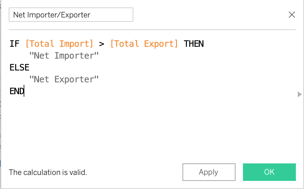
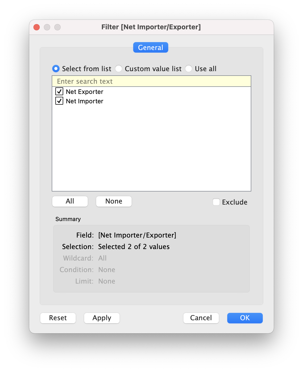
Drag & Drop “Net Importer/Exporter” onto filter Choose all and click OK
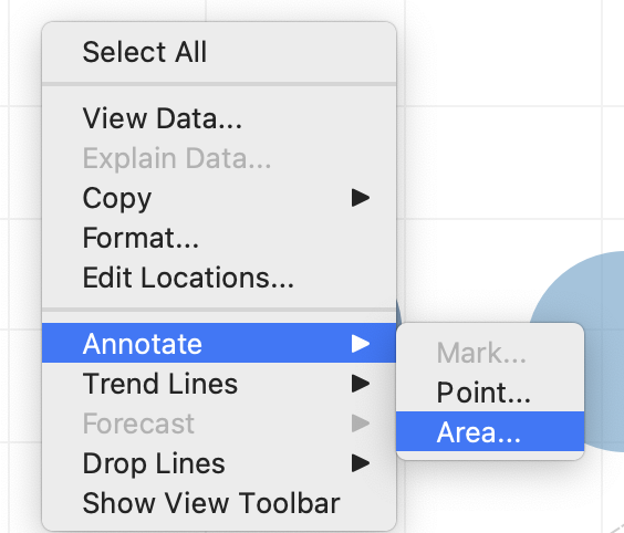
Annotate Net Importer and Net Exporter onto chart
Right click on an empty area in the chart > Annotate > Area
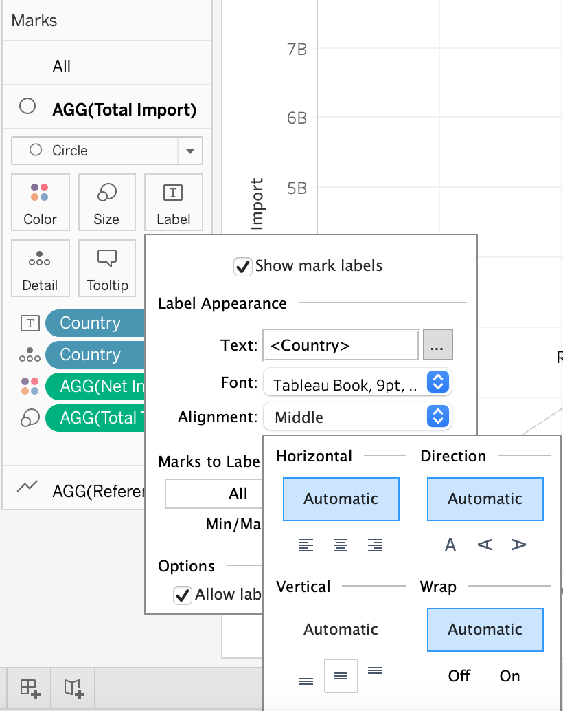
- Drag & Drop “Country” onto AGG(Total Import) > Label
Click on Alignment and Select Middle for Vertical Section. This will display country label in the middle of the bubble
5.0. Final Visualization
5.1. Snapshot of Graph
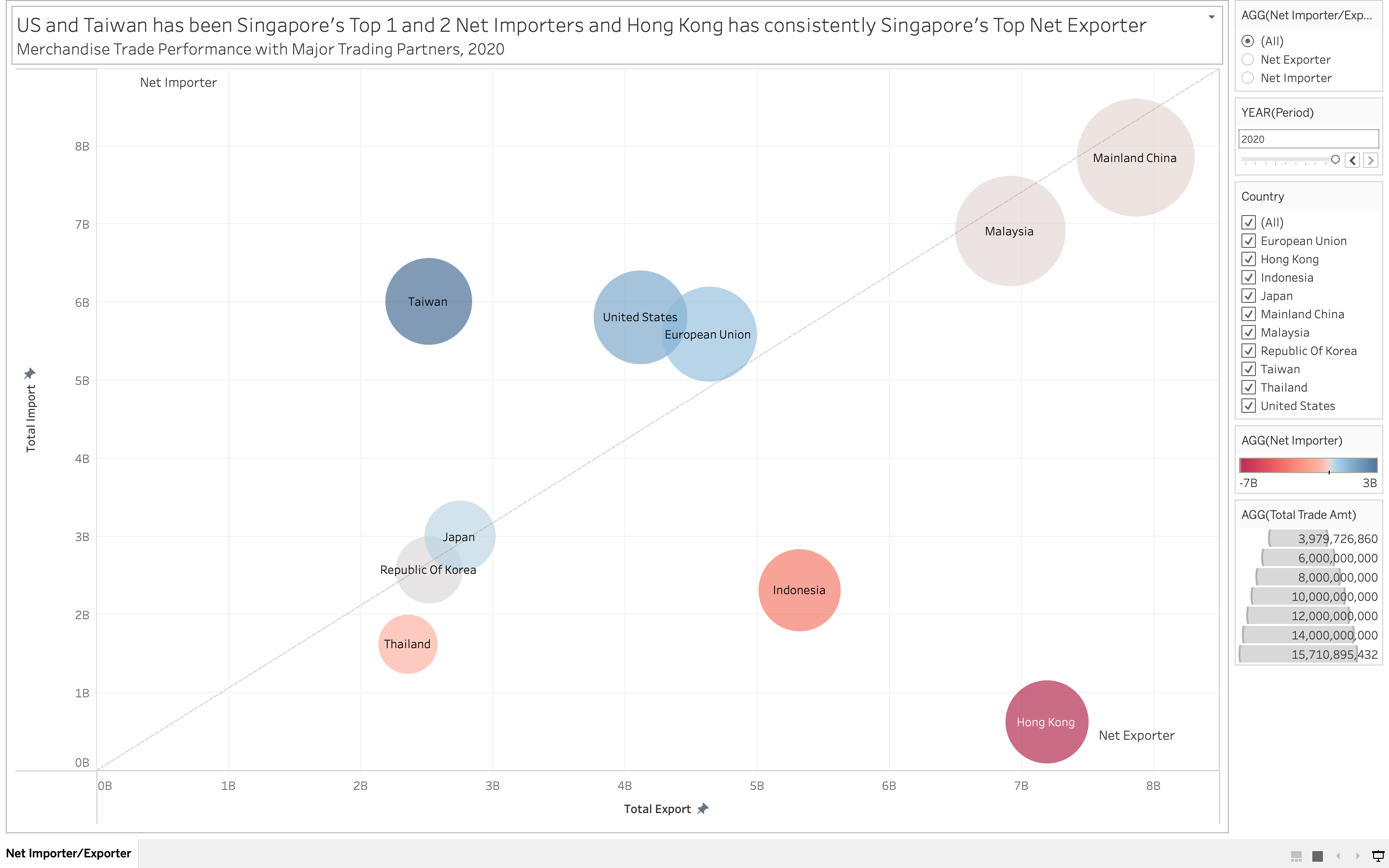
5.2. Major Observation and/or derived Insights
Based on the data observed, Hong Kong has been consistently ranked as Singapore Top 1 Net Exporters from Year 2011 to 2020 and Indonesia is ranked Second in Net Exporters from 2011 to 2020 as well. Taiwan has gradually becoming one of Singapore Top Net Importers from 2011 to 2013 and has held Rank 1 for about 5 years before United States took it’s place in Rank 1 for 2 years.
Whilst, Mainland China has been steadily ranked as the Singapore Top Importer and Exporter throughout the years, with the highest total merchandise trade values of more than $13 billions in the last 10 years, followed by Malaysia of more than $13 billions. Thailand on the other hand has the lowest total merchandise trade values of less than $4 billions.